Critique my new menu
hit me up with some feedback, i'm trying to perfect it before we talk to the printer
Replies to This Discussion
-
Permalink Reply by Jared Rutledge on
-
a car bomb is an iced coffee (2.50) plus two shots (.50 apiece).
we pay 29.9 cents per 18g double shot. (41.65 per 2.5kg bag) so that's 15 cents per single.
-
Permalink Reply by R. Justin Shepherd on
-
Seriously, this design is killing me. How much to license it for adaptation? :-)
-
-
email ben (at) mechanicalpixeldesign.com and ask haha
-
-
Oh. To a fellow cafe owner I show great courtesy... but I have no problem ripping off a graphic designer. :-)
Not really. Anyway looks great. Don't nitpick it to death.
-
Permalink Reply by Alexander Stephen Root on
-
I love it! I do agree on lightening the orange but it's a brilliant and inviting concept.
It reminds me of what Seattle's Best Coffee has done with their reinvented line. I like.
-
Permalink Reply by Benza Lance on
-
Out of curiosity, what are your milk alternatives?
-
Permalink Reply by Jay Caragay on
-
Jared-
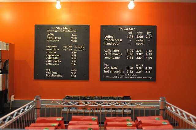
I don't know about your processes and methodologies, but are those prices based on your actual costs or just pulled out of thin air?
I mean, a capp for $2.50 - when espresso is $2.00? Fifty cents for milk and the labor (and skill) of steaming? Why even bother with an "American" Capp anyway?
New shop means the opportunity to really shake things up and try new things. This menu is just more of the same. Does it really translate into something new and exciting?
And juice for $1.50? Is it from Sysco?
The price of coffee has skyrocketed over the past several months. Your costs are increasing. I would definitely leave the prices off the menu board (actually, I did away with a menu board altogether) and leave them open to change.
-
-
milk alternatives - silk unsweetened organic soy, blue diamond unsweetened plain almond, horizon farms organic whole.
jay - if you'd bothered to read the top of this page where i explained my espresso costs, you'd see that i am very aware of what my costs are based on. for instance, i pay $2.49 a gallon for my current (rBGH free) whole milk. based on that, to steam 4 ounces of milk for a tradizionale costs me, in product, 7.8 cents. the labor is a concern, certainly, but the prices are in line with the rest of the menu. and remember the tradizionale is a single six ounce capp, it's not anything bigger. it costs me the same as a macchiato to make, thus the price is the same.
the juice isn't from sysco, it's cloudy natural apple juice i get from earth fare. a 14 oz. serving costs me 60 cents. i'm making 133% profit on something i merely have to pour into a cup. if you think it should be more, then present a facts-based case as to why that should be so instead of resorting to assumptions. but remember prices in asheville aren't what they are in baltimore. also, i believe both your stores have prices on the menu (at least your website indicates that this is the case).
i'm currently in LA and intelli is charging 2.50, tax included, for black cat. i don't think 2.00 for one of my espressos in a much smaller market is a stretch, even with prices being the way they are.
-
Permalink Reply by Timothy Pellizzer on
-
Very nice design. I wish our cafe had it. Is it easy to change prices? The Q'tears drink sounds interesting. Does it supply the taster with a layering of tastes? Is the fresh ginger from liquid or a root scrape? Good luck.
Tim
-
Permalink Reply by Nick Cho on
-
Jared, great menu design! I'm a big fan of creating a menu that helps customers navigate themselves to what they want.
Whenever I walk into a Chipotle, it strikes me how relatively easy it is to navigate your way through their menus. Conversely, I hate the Quiznos menus SO much. They change them up often (probably to force their franchisees to buy new menus from them), and they are very difficult to navigate. Basically, a customer shouldn't have to read too much before they know what they want... especially for coffee.
The last menu-board I designed was sorta like yours. Your concept also reminds me of the one Gwilym Davies did recently.
What I think I love the most about your design is how subtle messages are conveyed. "Coffee" is first. "Milk" and "Sweet" are up there at the same level, but "Coffee" is first... a great way to convey that message. The BEST part is that hierarchically, the top level is "WHAT WOULD YOU LIKE IN YOUR CUP?" Everything is subordinate to that question. What a great message!
My only question: are the color-coded "dots" next to each menu item really necessary? To me, it's a little clutter on an otherwise really clean and elegant design. Right now, every item has the same "dots" in a given column.
Also, how are you printing this? For the Chinatown menu, we had vinyl lettering printed at a sign shop affixed onto a piece of dark-gray construction material, which creates a semi-permanent solution. If you change prices or items, you just have to get it printed at the same place from a similar if not the same file, peel-off the old stuff, and you're good to go.
Overall looks SO great!
- ‹ Previous
- 1
- 2
- Next ›
Barista Exchange Partners
Keep Barista Exchange Free
Are you enjoying Barista Exchange? Is it helping you promote your business and helping you network in this great industry? Donate today to keep it free to all members. Supporters can join the "Supporters Group" with a donation. Thanks!
![]()
© 2026 Created by Matt Milletto.
Powered by
![]()